This system is in service at here (Chinese only)
Background and System Design Consideration
This project is done during my service in Division of Network Management, Computer and Information Center, NTU (NTU CCNet, 臺大計中網路組).
The need for customized visualization
The access points (APs) around the campus are all of the same brand, Aruba, and are controlled by several Aruba controllers respectively. Although controllers have some graphical user interface (GUI) to show statistics, the school still needs a system to integrate the data from all APs across all controllers. Furthormore, in addition to the line charts, which can be easily achieved by any database, a graph combined with campus map is a much more challenging while desirable feature, because maps can be more intuitive sometimes, and it unleashes another dimension of visualization which cannot be replaced by other visualization methods. With all these in mind, a customized database to collect data from all controllers, and a flexible visualization framework is proposed.
The need for raw data protection
The system is aimed at opening to the public network, so it does not make sense to simply redirect the public website url to the database itself. Instead, the database (ELK machine) is behind a firewall, and the front-end server fetch figures from the database periodically and only expose png files to the public.
System Architecture
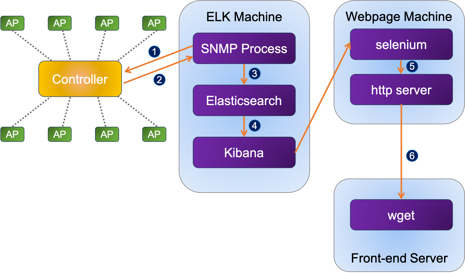
The system is composed of four building blocks: controllers, database, snapshot, and front-end server.

APs and Controllers
Access Points (APs) are connecteed with controllers, and the service information can be retrieved through controllers. This means we do not have to ping each of the thousands of APs; instead, we only need to contact with the controllers to get information we desire.
SNMP, Database, and Visualization
The process on ELK machine sends an SNMP request (snmpbulkwalk) to the Aruba controllers periodically to collect some metrics of interests. The controllers then reply the message with a standard TCP/IP package about the APs they managed to the SNMP request issuer. After receiving the reply from the controllers, the ELK machine saves the data into its elasticsearch database.
Next, we leverage Kibana as our main visualization backbone. Kibana is a visualization framework providing several built-in methods to visualize data from elasticsearch database. Some preset figures are saved in the Kibana service, and can be accessed through a fixed url. The content of the url is updated upon database refreshed. To protect the raw data from public access, the ELK machine is behind a firewall and thus completely hidden from public access.
Snapshot
With the figures ready on Kibana, the next step is to show the images onto the public website. In order to hide the Kibana interface from the public, Selenium is introduced to take snapshots, decoupling the interface from Kibana. Selenium is a browser automation tool, which can be used for routine webpage browsing actions. In our application, we use Selenium to connect to stored urls that contain pre-configured charts, and save the charts as png so that the interactivity of the Kibana is deprived. Consequently, the Kibana machine is perfectly hidden in the firewall, while its charts can still be viewed from the outside world.
Front-end webpage
Lastly, the figures are uploaded to some fixed address for the front-end server to fetch and present on the public website. (The front-end part is developed by another colleague and is out of my scope)
Region map
In addition to the basic line chart for QoS visualization, integration with map is what make this work Despite that Kibana has already provided plenty of useful visualization methods, one of its features, region map, still takes some efforts to complete. To be more specific, our ultimate goal is to draw some meaningful and easily-readable blocks onto a map, so we must define the geometry of the shapes on the map first. The geometries, of course, do not come in handy and take some efforts to acquire.
We use OpenStreetMap as the underlying layer. The most wonderful thing about this map is that it can export the shapes within a specified region. Therefore, with some data translation (xml to geojson), we are able to retrieve the shapes exactly the same as those in OpenStreetMap.